Genetic Networks 1 - Clustering
01 Jun 2023This lab was designed by Cody Markelz a former postdoc in the Maloof Lab. Cody went on to co-found the Cannabis breeding company Rev Genomics where he implemented the use of genetic networks to accelerate their breeding program. Cody now works as a fellow at the Berkeley Institute for Data Science developing mathematical models to increase our understanding of climate change, wildfires, and invasive species.
Assignment repository
Please clone your Assignment_11 repository and place your answers in the Assignment_11_template.Rmd file. When you are done push the .Rmd and .html files
Clustering Introduction
As you learned last lab, when we are dealing with genome scale data it is hard to come up with good summaries of the data unless you know exactly the question you are trying to ask. Today we will be exploring three different ways to cluster data and get visual summaries of the expression of the most variable genes in this experiment. Once we have these clusters, it allows us to ask further, more detailed, questions such as what GO categories are enriched in each cluster, or are there specific metabolic pathways contained in the clusters? While clustering can be used in an exploratory way, the basics you will be learning today have been extended to very sophisticated statistical/machine learning methods used across many disciplines. In fact, there are many different methods used for clustering in R outlined in this CRAN VIEW.
The two clustering methods that we will be exploring are hierarchical clustering and k-means. These have important similarities and differences that we will discuss in detail throughout today. The basic idea with clustering is to find how similar the rows and/or columns in the data set are based on the values contained within the data frame. You used a similar technique last lab when you produced the MDS plot of samples. This visualization of the the samples in the data set showed that samples from similar genotype and treatment combinations were plotted next to one another based on their Biological Coefficient of Variation calculated across all of the counts of genes.
Hierarchical Clustering
An intuitive example is clustering the distances between known geographic locations, such as US Cities. I took this example from this website. The basic procedure is to:
- Calculate a distance measure between all the row and column combinations in data set (think geographic distances between cities)
- Start all the items in the data out as belonging to its own cluster (every city is its own cluster)
- In the distance matrix, find the two closest points (find shortest distance between any two cities)
- Merge the two closest points into one cluster (merge BOS and NY in our example data set)
- Repeat steps 3 and 4 until all the items belong to a single large cluster
A special note: By default all the clusters at each merge take on the largest distance between any one member of the cluster and the remaining clusters. For example, the distance between BOS and DC is 429 miles, but the distance between NY and DC is 233. Because BOS/NY are considered one cluster after our first round, their cluster distance to DC is 429 All three of these cities are then merged into one cluster DC/NY/BOS. (Alternative approaches could be used, such as taking the mean distance or the shortest distance).
Change into your Assignment_11 directory.
You should have a file us_cities.txt in your Assignment_11/input directory. If not, or if you are not in BIS180L, you can download it as indicated below and move it to your Assignment_11 directory.
wget https://bis180ldata.s3.amazonaws.com/downloads/Genetic_Networks/us_cities.txt
Install a library
The ggdendrogram library makes nicer tree plots than the base package
install.packages("ggdendro") #only needs to be done once
library(tidyverse)
library(ggdendro)
Import the data
cities <- read.delim("../input/us_cities.txt",row.names = 1)

head(cities)
##       BOS   NY   DC  MIA  CHI  SEA   SF   LA  DEN
## BOS     0  206  429 1504  963 2976 3095 2979 1949
## NY    206    0  233 1308  802 2815 2934 2786 1771
## DC    429  233    0 1075  671 2684 2799 2631 1616
## MIA  1504 1308 1075    0 1329 3273 3053 2687 2037
## CHI   963  802  671 1329    0 2013 2142 2054  996
## SEA  2976 2815 2684 3273 2013    0  808 1131 1307
The function as.dist() tells R that the cities data frame should be used as a distance matrix. The function hclust() performs hierarchical clustering on the distance matrix.
cities_hclust <- cities %>% as.dist() %>% hclust()
ggdendrogram(cities_hclust)
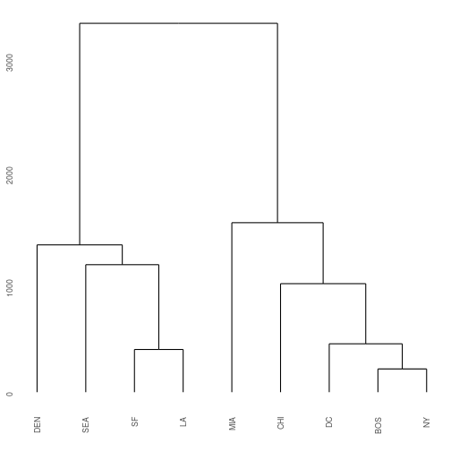
Exercise 1: Extending the example that I gave for BOS/NY/DC, what are the distances that define each split in the West Coast side of the hclust plot?
Hint 1: Start with the distances between SF and LA. Then look at the difference between that cluster to SEA, etc.
Hint 2: Examine the cities object, you only need to look at the upper right triangle of data matrix.
End of exercise 1
Now that we have that example out of the way, lets start using this technique on biological data. This week will be a review of all the cool data manipulation steps you have learned in past weeks. I would like to emphasize that printing dataframes (or parts of them) is a really fast way to get an idea about the data you are working with. Visual summaries like printed data, or plotting the data are often times the best way to make sure things are working the way they should be and you are more likely to catch errors. I have included visual summaries at all of the points where I would want to check on the data.
We continue working with the Brassica rapa RNAseq data set. The data set that you used so far only had 12 RNA-seq libraries in it. However, that subset of data was part of a much larger study that we are going to explore today. This data set consists of RNA-seq samples collected from 2 genotypes of Brassica rapa (R500 and IMB211) that were grown in either dense (DP) or non-dense planting (NDP) treatments in the greenhouse, or in the field. The researcher that did this study, Upendra, also collected tissue from multiple tissue types including: Leaf, Petiole, Internode (you worked with this last week), and Silique (the plant seed pod). There were also 3 biological replicates of each combination (Rep 1, 2, 3). If your head is spinning thinking about all of this, do not worry, data visualization will come to the rescue here in a second. In total we will be working with 57 samples.
Remember last week when we were concerned with what distribution the RNA-seq count data was coming from so that we could have a good statistical model of it? Well, if we want to perform good clustering we also need to think about this because most of the simplest clustering assumes data to be from a normal distribution. I have transformed the RNAseq data to be normally distributed for you, but if you every need to do it yourself you can do so with the function voom from the limma package.
Lets start by loading the two data sets. Then we can subset the larger full data set to include only the genes that we are interested in from our analysis last week.
Download and import the data
Download the data set. Move it to Assigment_11/input
wget https://bis180ldata.s3.amazonaws.com/downloads/Genetic_Networks/voom_transform_brassica.csv.gz
Next, import it:
# make sure to change the path to where you downloaded this using wget
brass_voom_E <- read_csv("../input/voom_transform_brassica.csv.gz")
head(brass_voom_E[,1:6])
## # A tibble: 6 × 6
##   GeneID    IMB211_INTERNODE_DP_1 IMB211_LEAF_DP_1 IMB211_PETIOLE_DP_1 IMB211_SILIQUE_DP_1 IMB211_INTERNODE_DP_2
##   <chr>                     <dbl>            <dbl>               <dbl>               <dbl>                 <dbl>
## 1 Bra000002                 1.83             -3.21                3.88             -0.583                  3.95
## 2 Bra000003                 5.34              6.57                6.18              4.15                   5.47
## 3 Bra000004                 0.592             2.22                1.65             -0.0972                 0.596
## 4 Bra000005                 5.87              5.07                5.41              5.82                   5.80
## 5 Bra000006                 4.32              3.42                4.39              6.62                   4.78
## 6 Bra000007                 1.15              1.75                2.36              1.00                   1.97
data selection and scaling
What genes should we use to build our networks? Including all of the genes in the data set could be hard to manage and hard to visualize. A common approach is to focus on those genes that are most variable across the data set. We will select the 1,000 most variable genes.
First we will calculate the coefficient of variation for each gene. This is a standardized measure of variation.
calc.cv <- function(x, na.rm=TRUE) { # function to calculate the coefficient of variation
  if(na.rm==TRUE) x <- na.omit(x)
  result <- sd(x) / mean(x) # CV calculation
  result <- abs(result) # no negative CVs!
  return(result)
}

#Doing this with base R because tidy is slow on row-wise calculations
brass_voom_E$cv  <- apply(brass_voom_E[,-1], 1, calc.cv)

brass_voom_E <- brass_voom_E %>%  select(GeneID, cv, everything()) # reorder columns

head(brass_voom_E[,1:6])
## # A tibble: 6 × 6
##   GeneID        cv IMB211_INTERNODE_DP_1 IMB211_LEAF_DP_1 IMB211_PETIOLE_DP_1 IMB211_SILIQUE_DP_1
##   <chr>      <dbl>                 <dbl>            <dbl>               <dbl>               <dbl>
## 1 Bra000002 5.50                   1.83             -3.21                3.88             -0.583
## 2 Bra000003 0.0981                 5.34              6.57                6.18              4.15
## 3 Bra000004 2.54                   0.592             2.22                1.65             -0.0972
## 4 Bra000005 0.0915                 5.87              5.07                5.41              5.82
## 5 Bra000006 0.200                  4.32              3.42                4.39              6.62
## 6 Bra000007 1.22                   1.15              1.75                2.36              1.00
Exercise 2:
Create a new object brass_voom_E_1000 that has the 1000 most variable genes, based on the cv column. Hint: you probably want to use one of the slice functions–review tidyverse tutorial for a refresher The first six rows of the first 6 columns will look like this:
## # A tibble: 6 × 6
##   GeneID        cv IMB211_INTERNODE_DP_1 IMB211_LEAF_DP_1 IMB211_PETIOLE_DP_1 IMB211_SILIQUE_DP_1
##   <chr>      <dbl>                 <dbl>            <dbl>               <dbl>               <dbl>
## 1 Bra040302 10141.                 1.15           -0.0364               2.24                0.555
## 2 Bra031133  4217.                -1.17           -2.21                -1.91                5.57
## 3 Bra014780  2878.                 0.592           2.35                 1.30                2.00
## 4 Bra012071  2651.                -1.17           -1.62                 0.738              -1.32
## 5 Bra008570  2134.                -3.50           -3.21                 4.72                4.59
## 6 Bra003557  2018.                -0.326          -0.884               -1.10                2.59
End of exercise 2
Finally, we will scale and center the data so that each gene has a mean of 0 and a standard deviation of 1. This prevents genes with high expression from having an undue influence on our results. We will also convert the data frame to a matrix since many of the downstream functions require our data to be in that form.
E_matrix <- brass_voom_E_1000 %>%
  select(-GeneID, -cv) %>%
  as.matrix() %>%
  scale()
Calculate Distance
For the cities example we already knew the distance between points. For our gene expression data we have to compute the distance between genes or samples. Here a larger distance indicates more dissimilarity in RNA expression values.
We use the dist()function to compute the Euclidean distance between our data points. (Other distance metrics are available, look at ?dist if you are curious.)
gene_hclust_row <- E_matrix %>% dist() %>% hclust()
ggdendrogram(gene_hclust_row)
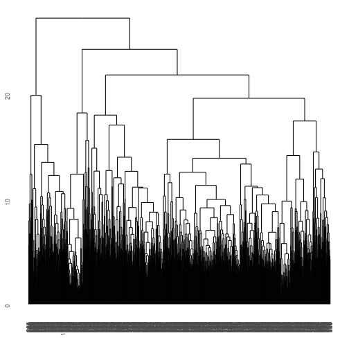
What a mess! We have clustered similar genes to one another but that are too many genes, so we are overplotted in this direction. How about if we cluster by column instead? Notice we have to transpose the data using t(). Also, make sure you stretch out the window so you can view it!
gene_hclust_col <- E_matrix %>% t()  %>% dist() %>% hclust()
ggdendrogram(gene_hclust_col)
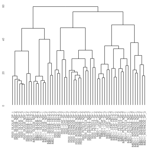
Exercise 3: What patterns are present in the clustered data? Specifically, there are three major clusters here. How would you describe each cluster? Is genotype or treatment a more important determinant of clustering? In your .Rmd file you can click on the left icon above the plot to display it in its own window
End of exercise 3
We have obtained a visual summary using h-clustering. Now what? We can go a little further and start to define some important sub-clusters within our tree. We can do this using the rect.hclust() function. Once again make sure you plot it so you can stretch the axes.
Here we have to use the “base” plotting function… Type ?rect.hclust in the console for more information
plot(gene_hclust_col, cex=.6) #redraw the tree everytime before adding the rectangles
rect.hclust(gene_hclust_col, k = 6, border = "red")
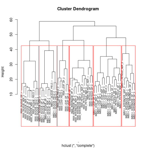
Exercise 4:
First, read the help file for rect.hclust(), then:
a With k = 6 as one of the arguments to the rect.hclust() function, how are the samples being split into clusters?
b What does the k parameter specify?
c Play with the k-values between 3 and 7. Describe how the size of the clusters change when changing between k-values.
End of exercise 4
You may have noticed that your results and potential interpretation of the data could change very dramatically based on the how many subclusters you choose! This is one of the main drawbacks with this technique. Fortunately there are other packages such as pvclust that can help us determine which sub-clusters have good support.
The package pvclust (?pvclust, after loading the library, for more information) assigns p-values to clusters. It does this by bootstrap sampling of our dataset. Bootstrapping is a popular resampling technique that you can read about more here. The basic idea is that many random samples of your data are taken and the clustering is done on each of these resampled data sets. We then ask how often the branches present in the original data set appear in the resampled data set. If a branch appears many times in the resampled data set that is good evidence that it is “real”.
library(pvclust)

set.seed(12456) #This ensure that we will have consistent results with one another

fit <- pvclust(E_matrix, method.hclust = "ward.D", method.dist = "euclidean", nboot = 50)
## Bootstrap (r = 0.5)... Done.
## Bootstrap (r = 0.6)... Done.
## Bootstrap (r = 0.7)... Done.
## Bootstrap (r = 0.8)... Done.
## Bootstrap (r = 0.9)... Done.
## Bootstrap (r = 1.0)... Done.
## Bootstrap (r = 1.1)... Done.
## Bootstrap (r = 1.2)... Done.
## Bootstrap (r = 1.3)... Done.
## Bootstrap (r = 1.4)... Done.
plot(fit, print.num=FALSE) # dendogram with p-values
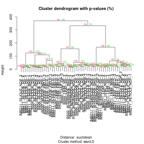 The green values are the “Bootstrap Percentage” (BP) values, indicating the percentage of bootstrap samples where that branch was observed. Red values are the “Approximate Unbiased” (AU) values which scale the BP based on the number of samples that were taken. In both cases numbers closer to 100 provide more support.
Exercise 5: After running the 50 bootstrap samples, make a new plot but change nboot up to 1000. In general what happens to BP and AU?
End of exercise 5
We will be discussing more methods for choosing the number of clusters in the k-means section. Until then, we will expand what we learned about h-clustering to do a more sophisticated visualization of the data.
Heatmaps
Heatmaps are another way to visualize h-clustering results. Instead of looking at either the rows (genes) or the columns (samples) like we did with the h-clustering examples we can view the entire data matrix at once. How do we do this? We could print the matrix, but that would just be a bunch of numbers. Heatmaps take all the values within the data matrix and convert them to a color value. The human eye is really good at picking out patterns so lets convert that data matrix to a color value AND do some h-clustering. Although we can do this really easily with the heatmap() function that comes pre-loaded in R, there is a small library that provides some additional functionality for heatmaps. We will start with the cities example because it is small and easy to see what is going on.
A general programming tip: always have little test data sets. That allows you to figure out what the functions are doing. If you understand how it works on a small scale then you will be better able to troubleshoot when scaling to large datasets.
library(gplots) #not to be confused with ggplot2!
head(cities) # city example
##       BOS   NY   DC  MIA  CHI  SEA   SF   LA  DEN
## BOS     0  206  429 1504  963 2976 3095 2979 1949
## NY    206    0  233 1308  802 2815 2934 2786 1771
## DC    429  233    0 1075  671 2684 2799 2631 1616
## MIA  1504 1308 1075    0 1329 3273 3053 2687 2037
## CHI   963  802  671 1329    0 2013 2142 2054  996
## SEA  2976 2815 2684 3273 2013    0  808 1131 1307
We will be using the plotting function heatmap.2, you can look at the arguments by entering ?heatmap.2 in the console
heatmap.2(as.matrix(cities), Rowv=as.dendrogram(cities_hclust), scale="row", density.info="none", trace="none")
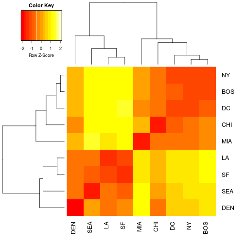
Exercise 6: We used the scale rows option. This is necessary so that every row in the data set will be on the same scale when visualized in the heatmap. This is to prevent really large values somewhere in the data set dominating the heatmap signal. Remember if you still have this data set in memory you can take a look at a printed version to the terminal. Compare the distance matrix that you printed with the colors of the heat map. See the advantage of working with small test sets? Take a look at your plot of the cities heatmap and interpret what a dark red value and a light yellow value in the heatmap would mean in geographic distance. Provide an example of each in your explanation.
End of exercise 6
Now for some gene expression data.
heatmap.2(E_matrix, Rowv = as.dendrogram(gene_hclust_row), density.info="none", trace="none", margins = c(10,5))
Exercise 7: In the similar way that you interpreted the color values of the heatmap for the city example, come up with a biological interpretation of the yellow vs. red color values in the heatmap. Hint:! Think about what is being plotted on the heatmap. It is distance in the cities example. Is it distance for gene expression or something else?
Exercise 8: The genes are overplotted so we cannot distinguish one from another. However, is there a set of genes that are expressed mostly highly in siliques? where? (general description of location, e.g. “top rows” is fine) Is there a set of genes that is expressed mostly highly in R500 vs IMB211? where?
k-means clustering
K-means clustering tries to fit “centering points” to your data by chopping your data up into however many “k” centers you specify. If you pick 3, then you are doing 3-means centering to your data or trying to find the best 3 centers that describe all of your data. The basic steps are:
- Randomly assign each sample in your data set to one of k clusters.
- Calculate the mean of each cluster (aka the center)
- Update the assignments by assigning samples to the cluster whose mean they are closest to.
- Repeat steps 2 and 3 until assignments stop changing.
To build some intuition about how these things work there is a cool R package called “animation”. This is what I used in lecture. These examples are based directly on the documentation for the functions so if you wanted to look at how some other commonly used methods work with a visual summary I encourage you to check out this package on your own time.
# you do not have to run this code chunk
# library(animation)

# kmeans.ani(x = cbind(X1 = runif(50), X2 = runif(50)), centers = 3,
# hints = c("Move centers!", "Find cluster?"), pch = 1:3, col = 1:3)

# kmeans.ani(x = cbind(X1 = runif(50), X2 = runif(50)), centers = 10,
# hints = c("Move centers!", "Find cluster?"), pch = 1:3, col = 1:3)

# kmeans.ani(x = cbind(X1 = runif(50), X2 = runif(50)), centers = 5,
# hints = c("Move centers!", "Find cluster?"), pch = 1:3, col = 1:3)
To learn about when k-means is not a good idea, see this post
Now that you have a sense for how this k-means works, lets apply what we know to our data. Lets start with 9 clusters, but please play with the number of clusters and see how it changes the visualization. We will need to run a quick Principle Component Analysis (similar to MDS), on the data in order to visualize how the clusters are changing with different k-values.
Here we will look at clustering genes. (each point will be a gene)
library(ggplot2)

# get principle components
prcomp_counts <- prcomp(E_matrix)
scores <- as.data.frame(prcomp_counts$x)[,c(1,2)]

set.seed(25) #make this repeatable as kmeans has random starting positions
fit <- kmeans(E_matrix, 9)
clus <- as.data.frame(fit$cluster)
names(clus) <- paste("cluster")

plotting <- merge(clus, scores, by = "row.names")
plotting$cluster <- as.factor(plotting$cluster)

# plot of observations
ggplot(data = plotting, aes(x = PC1, y = PC2, label = Row.names, color = cluster)) +
  geom_hline(yintercept = 0, colour = "gray65") +
  geom_vline(xintercept = 0, colour = "gray65") +
  geom_point(alpha = 0.8, size = 2, stat = "identity")
Exercise 9: Pretty Colors! Why would it be a bad idea to have too few or too many clusters? Discuss with a specific example comparing few vs. many k-means. Justify your choice of too many and too few clusters by describing what you see in each case.
Gap statistic
The final thing that we will do today is try to estimate, based on our data, what the ideal number of clusters is. For this we will use something called the Gap statistic.
library(cluster)
set.seed(125)
gap <- clusGap(E_matrix, FUN = kmeans, iter.max = 30, K.max = 20, B = 100)
plot(gap, main = "Gap Statistic")
This is also part of the cluster package that you loaded earlier. It will take a few minutes to calculate this statistic. In the mean time, check out some more information about it in the ?clusGap documentation. We could imagine that as we increase the number of k-means to estimate, we are always going to increase the fit of the data. The extreme examples of this would be if we had k = 1000 for the total number of genes in the data set or k = 1. We would be able to fit the data perfectly in the k = 1000 case, but what has it told us? It has not really told us anything. Just like you played with the number of k-means in Exercise 9, we can also do this computationally! We want optimize to have the fewest number of clusters that can explain the variance in our data set.
Exercise 10: Based on the above Gap statistic plot, at what number of k clusters (x-axis) do you start to see diminishing returns? To put this another way, at what value of k does k-1 and k+1 start to look the same for the first time? Or yet another way, when are you getting diminishing returns for adding more k-means? See if you can make the trade off of trying to capture a lot of variation in the data as the Gap statistic increases, but you do not want to add too many k-means because your returns diminish as you add more. Explain your answer using the plot as a guide to help you interpret the data.
Now we can take a look at the plot again and also print to the terminal what clusGap() calculated.
with(gap, maxSE(Tab[,"gap"], Tab[,"SE.sim"], method="firstSEmax"))
Exercise 11: What did clusGap() calculate? How does this compare to your answer from Exercise 10? Make a plot using the kmeans functions as you did before, but choose the number of k-means you chose and the number of k-means that are calculated from the Gap Statistic. Describe the differences in the plots.
End of Exercise 11
Plot the clusters
So what are these clusters? The code below will plot gene expression for each gene in each cluster for K=8.
set.seed(25) #make this repeatable as kmeans has random starting positions
fit8 <- kmeans(E_matrix, 8)
clus8 <- as.data.frame(fit8$cluster)
names(clus8) <- paste("cluster")

clus8 <- cbind(clus8, E_matrix) %>% # add cluster labels to gene expression matrix
  mutate(gene_index=1:nrow(clus8)) # would be better to bring in gene names but OK for now.

clus8 <- clus8 %>% pivot_longer(c(-cluster, -gene_index), names_to = "sample_ID", values_to = "expression") %>% # get ready for plotting
  mutate("sample_group" = str_remove(sample_ID, "_.$"))

clus_summary <- clus8 %>% # average across replicates
  group_by(gene_index, cluster, sample_group) %>%
  summarize(expression = mean(expression))

clus_summary %>% ggplot(aes(x=sample_group, y=expression, group=gene_index)) + # plot it
  geom_line(alpha=.05) +
  facet_wrap(~cluster, ncol=4) +
  coord_fixed(ratio=1) +
  theme(axis.text.x = element_text(angle = 90, size = 7, hjust = 1, vjust = 0))
Exercise 12: Based on the plot above, how would you describe the genes grouped in cluster 5? how about cluster 7? cluster 8?
Good Job Today! There was a lot of technical stuff to get through. If you want more (or even if you don’t), check out the “Genetic Networks-2” lab where you can build co-expression networks and study their properties using a few of the techniques that you learned today. BIS180L will do this next lab period.