Genetic Networks 2 - Co-Expression
06 Jun 2023Introduction
Biological Context
In the past few weeks we have taken data off the sequencer, aligned the reads to our reference genome, calculated counts for the number of reads that mapped to each gene in our reference genome, found out what genes are differentially expressed between our genotype treatment combinations, and started to interpret the data using clustering.
With these large data sets there is more than one way to look at the data. As biologists we need to critically evaluate what the data is telling us and interpret it using our knowledge of biological processes. In our case we have an environmental perturbation that we have imposed on the plants by altering the density of plants in a given pot. Understanding mechanistically how plants respond to crowding is important for understanding how plants grow and compete for resources in natural ecosystems, and how we might manipulate plants to grow optimally in agroecosystems. In our case, we have two genotypes of plants that show very different physiological and morphological responses to crowding. We have a lot of data, some quantitative, some observational, that support this. Plant growth, just like the growth of any organism, is a really complicated thing. Organisms have evolved to interact with the environment by taking in information from their surroundings and trying to alter their physiology and biochemistry to better live in that environment.
We know a lot about the details of how environmental signals are intercepted by the organisms, but we know less how this translates to changes in biochemistry, physiology, development, growth, and ultimately reproductive outputs. In our case, plants receive information about their neighbors through detecting changes in light quality through the phytochrome light receptors. This is a focus of the Maloof lab. You can read more generally about the way plants perceive these changes here. We want to understand how plants connect the upstream perception of environmental signals (in this case the presence of neighbors) and how this information cascades through the biological network of the organism to affect the downstream outputs of physiological and developmental changes. To get an approximation of what is going on in the biological network we need to work with an intermediate form of biological information: gene expression. Although there are important limitations to only using gene expression data which we will discuss during the lecture, it should provide some clues as to how to best connect the upstream environmental perception with the downstream growth outputs.
Review
In previous sections you learned about techniques to reduce high-dimensional genomics data sets by projecting them onto a simpler two dimensional representation. The axes of this projection describes the two largest axes of variation contained within the data set. Each of these axes of variation is called a principle component (PC for short). In our high-dimensional gene expression data set we can define the largest axes of variation in the data set and plot them onto a 2D plane.
K-means clustering allows us to search this higher dimensional space for patterns in the data, find the patterns, and assign cluster numbers to each gene in the data set. When we combine PC plots with k-means plots we can assign a color value to each cluster like you did for exercise 9. We will now build on these ideas of data reduction and visualization to build a mutual rank based gene co-expression network.
Networks Intuition
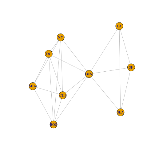
In our example data set from last time we used US cities to represent individual nodes that cluster together with one another based on relationships of geographic distances between each city. To put this in network terminology, each individual city is a node.
(NY)
(BOS)
(DC)
The relationships, or edges, between nodes were defined by measurements of geographic distance.
(NY)–MILES–(BOS)
(NY)–MILES–(SF)
Repository
Clone the Assignment_12 repository
Libraries
library(tidyverse)
library(igraph) # for graph manipulations and plotting
Get started
Okay, let’s load up our city data again and get started by playing with some examples!
The cities data is included in the Assignment 12 repo, but if you aren’t taking BIS180L and need to download the file again, here is the address:
wget https://bis180ldata.s3.amazonaws.com/downloads/Genetic_Networks/us_cities.txt
Load the data into R.
cities <- read.delim("../input/us_cities.txt", row.names=1) # be sure to change the path if needed
cities
##       BOS   NY   DC  MIA  CHI  SEA   SF   LA  DEN
## BOS     0  206  429 1504  963 2976 3095 2979 1949
## NY    206    0  233 1308  802 2815 2934 2786 1771
## DC    429  233    0 1075  671 2684 2799 2631 1616
## MIA  1504 1308 1075    0 1329 3273 3053 2687 2037
## CHI   963  802  671 1329    0 2013 2142 2054  996
## SEA  2976 2815 2684 3273 2013    0  808 1131 1307
## SF   3095 2934 2799 3053 2142  808    0  379 1235
## LA   2979 2786 2631 2687 2054 1131  379    0 1059
## DEN  1949 1771 1616 2037  996 1307 1235 1059    0
Take a look at the printed matrix. Imagine that we are an airline and want to calculate the best routes between cities. However, the planes that we have in our fleet have a maximum fuel range of only 1500 miles. This would put a constraint on our city network. Cities with distances greater than 1500 miles between them would no longer be reachable directly. Their edge value would become a zero. Likewise, if two cities are within 1500 miles, their edge value would become 1. This 1 or 0 representation of the network is called the network adjacency matrix.
let’s create an adjacency matrix for our test data set.
cities_mat_1500 <- cities < 1500 # leave original matrix intact
diag(cities_mat_1500) <- 0 # we do not have to fly within each of cities :)
cities_mat_1500 # check out the adjacency matrix
##      BOS NY DC MIA CHI SEA SF LA DEN
## BOS    0  1  1   0   1   0  0  0   0
## NY     1  0  1   1   1   0  0  0   0
## DC     1  1  0   1   1   0  0  0   0
## MIA    0  1  1   0   1   0  0  0   0
## CHI    1  1  1   1   0   0  0  0   1
## SEA    0  0  0   0   0   0  1  1   1
## SF     0  0  0   0   0   1  0  1   1
## LA     0  0  0   0   0   1  1  0   1
## DEN    0  0  0   0   1   1  1  1   0
Exercise 1:
Based on this 0 or 1 representation of our network, what city is the most highly connected? Hint: sum the values down a column OR across a row for each city
Try extending the range to 2000 miles in the above code (place the adjacency matrix in an object cities_mat_2000. Does the highest connected city change? If so explain.
Plotting networks
NOTE: The graph layout algorithms are somewhat stochastic; your graphs will look somewhat different than what are displayed here
Now plot this example to see the connections based on the 2000 mile distance cutoff. It should show the same connections as in your adjacency matrix.
# make sure to use the 2000 mile distance cutoff
cities_graph2000 <- graph.adjacency(cities_mat_2000, mode = "undirected")
plot(cities_graph2000)
 Exercise 2:
(A) What is the total number of nodes in the plot?
(B) Use the adjacency matrix to calculate the number of edges (you might want to check your work by counting edges in the plot above). What is the total number of edges in the plot? Include your code.
This 1 or 0 representation of the network is a very useful simplification that we will take advantage of when trying construct biological networks. We will define each gene as a node and the edges between the nodes as some value that we can calculate to make an adjacency matrix.
(Gene1)
(Gene2)
(Gene3)
(Gene1)–Value?–(Gene2)
We do not have geographic distance between genes, but we do have observations of each gene’s relative expression values across the Genotype by Environment by Tissue type combinations. We can use similarity in gene expression values to measure the biological distance between genes. Genes that are expressed in more similar patterns should be closer.
A simple way to do this would be to calculate a correlation coefficient (a value between -1 and +1) between each gene with every other gene in our data set. The network would look like this for all gene pairs:
(Gene1)–Correlation–(Gene2)
There are MANY important caveats and limitations to this approach outlined here, but they still can be useful.
One problem with correlation-based networks is that the correlation coefficient can be affected by many things (including technical details of the experiment) that we don’t care about. A better choice is to the the Mutual Correlation Ranks, as explained here.
To calculate the mutual ranks we take the following steps:
- Compute the pairwise correlation coefficient for all gene pairs
- For each gene, rank its correlation coefficients from highest to lowest.
- Note that the ranks computed in step 2 are not necessarily symmetric. So, for each gene pair compute the (geometric) average of ranks.
Once we have done this, our network will look like this for all gene pairs:
(Gene1)–MutualRank–(Gene2)
Let’s get started.
- We are going to focus on the internode, petiole, and leaf samples.
- We are going to focus on genes differentially expressed between the DP and NDP treatments.
Either create a symbolic link to the gene expression file from Assignment_11 from your assignment_12/input directory or re-download:
wget https://bis180ldata.s3.amazonaws.com/downloads/Genetic_Networks/voom_transform_brassica.csv.gz
The list of genes differentially expressed in response to the DP/NDP treatment should be in the input folder. (You also calculated this in an earlier lab, but use the one provided so we all have the same file). If it is not in your input folder you can download it with:
wget https://bis180ldata.s3.amazonaws.com/downloads/RNAseq_Annotation/DEgenes.trt.csv
Load the data into R.
# make sure to change the path if needed
trt.genes <- read_csv("../input/DEgenes.trt.csv")


# make sure to change the path to where you downloaded this using wget
brass_voom_E <- read_csv("../input/voom_transform_brassica.csv.gz") %>%
  select(GeneID, matches("INTERNODE|PETIOLE|LEAF")) # subset the data to only keep the columns we want
head(brass_voom_E[,1:6])
Make a smaller data frame and matrix with only the genes differentially expressed by treatment
brass_voom_E_trt <- brass_voom_E %>%
  semi_join(trt.genes)
## Joining, by = "GeneID"
E_matrix_trt <- brass_voom_E_trt %>%
  as.data.frame() %>%
  column_to_rownames("GeneID") %>%
  as.matrix()
load annotation
Either create a symbolic link to the gene annotation file from Assignment_10 from your assignment_12/input directory or re-download:
wget https://bis180ldata.s3.amazonaws.com/downloads/RNAseq_Annotation/FileS9.txt
annotation <- read_tsv("../input/FileS9.txt",col_names = c("GeneID","description"))
## Rows: 44239 Columns: 2
## ── Column specification ──────────────────────────────────────────────────────────────────────────────────────────────────────────
## Delimiter: "\t"
## chr (2): GeneID, description
##
## ℹ Use `spec()` to retrieve the full column specification for this data.
## ℹ Specify the column types or set `show_col_types = FALSE` to quiet this message.
head(annotation)
## # A tibble: 6 × 2
##   GeneID    description
##   <chr>     <chr>
## 1 Bra000001 DNAse I-like superfamily protein
## 2 Bra000002 nodulin MtN21 /EamA-like transporter family protein
## 3 Bra000003 No annotation found
## 4 Bra000004 No annotation found
## 5 Bra000005 ARF-GAP domain 7
## 6 Bra000006 Histone superfamily protein
Calculate Mutual Ranks
To Illustrate the process let’s begin with just 5 genes.
Subset the data to just five genes
E_matrix_5 <- E_matrix_trt[11:15,]
Create correlation matrix
E_matrix_5_cor <- cor(t(E_matrix_5))
E_matrix_5_cor %>% round(3)
Set the diagonal to 0:
diag(E_matrix_5_cor) <- 0
E_matrix_5_cor %>% round(3)
Rank the correlations for each gene. We will use the absolute correlation value, so positive or negative correlations will be treated the same. This will lead to an unsigned network.
E_matrix_5_rank <- apply(E_matrix_5_cor,2,function(x) rank(-abs(x)))
E_matrix_5_rank
Exercise 3:
(A) Describe what is meant by the “1” in the [“Bra000937”, “Bra000662”] cell.
(B) Do [“Bra000937”, “Bra000662”] and [“Bra000662”, “Bra000937”] have different values? What does this indicate?
Now compute the pairwise mutual ranks (aka average ranks) by taking the geometric mean:
E_matrix_5_MR <- sqrt(E_matrix_5_rank * t(E_matrix_5_rank))
E_matrix_5_MR %>% round(3)
(C) Do [“Bra000937”, “Bra000662”] and [“Bra000662”, “Bra000937”] have different values in the MR tables? Did this change from question B? Why or why not?
We next need to construct an adjacency matrix of this gene network. To do so, let’s put some constraints on what we want to call an edge. In this case let’s only place edges between genes when their mutual rank is 2 or less.
Exercise 4:
(A) Create the adjacency matrix described above and place it in an object called genes_adj_MR2. It should look like this:
##           Bra000662 Bra000840 Bra000875 Bra000937 Bra000981
## Bra000662         0         0         0         1         1
## Bra000840         0         0         1         1         1
## Bra000875         0         1         0         0         0
## Bra000937         1         1         0         0         0
## Bra000981         1         1         0         0         0
(B) Which gene has the highest degree centrality? What genes is it connected to?
Okay, I think now that we have the basic concepts, let’s work with the larger gene expression data set.
Exercise 5:
(A)
Working with the the full E_matrix_trt matrix, create an adjacency matrix called genes_adj_MR4 for the genes use a cutoff of MR < = 4. Remember to set the diagonal of the adjacency matrix to 0. Create a second adjacency matrix genes_adj_MR10 using a cutoff of of MR < = 10.
(B) Now we can do some calculations. If our cutoff is MR4, how many edges do we have in our trt node network? What if we increase our cutoff to MR10? hint: sum( )
Exercise 6:
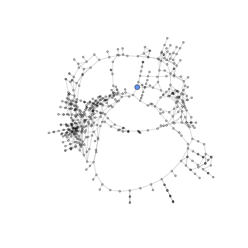
Use the following code to plot our networks using different thresholds for connectivity. What do the colors represent? What patterns do you see in the visualization of this data? You will need to click on the zoom button on the plot to be able to visualize this well.
gene_graphMR4 <- graph.adjacency(genes_adj_MR4, mode = "undirected") #convert adjacency to graph
compsMR4 <- clusters(gene_graphMR4)$membership                        #define gene cluster membership
colbar <- rainbow(max(compsMR4)+1)                                   #define colors
V(gene_graphMR4)$color <- colbar[compsMR4+1]                          #assign colors to nodes
plot(gene_graphMR4, layout = layout_with_fr, vertex.size = 4, vertex.label = NA, main="MR 4")

gene_graphMR10 <- graph.adjacency(genes_adj_MR10, mode = "undirected") #convert adjacency to graph
compsMR10 <- clusters(gene_graphMR10)$membership                        #define gene cluster membership
colbar <- rainbow(max(compsMR10)+1)                                   #define colors
V(gene_graphMR10)$color <- colbar[compsMR10+1]                          #assign colors to nodes
plot(gene_graphMR10, layout = layout_with_fr, vertex.size = 4, vertex.label = NA, main="MR 10")
Graph Statistics for Network Comparison
Graph density is a measure of the total number of edges between nodes out of the total possible number of edges between nodes. It is a useful metric if you want to compare two networks with a similar number of nodes. We could have split our data into the two treatments (DP and NDP) at the beginning of our analysis, built separate networks for each, then used metrics like this to compare the network properties between treatments.
Another really cool property of graphs is we can ask how connected any two nodes are to one another by performing a path analysis through the network. Think about the cities network. If we wanted to get from BOS to SF but we had our plane fuel constraints we could not fly between the two cities on a direct flight. We will have to settle for a layover. A path analysis can find the flight path between cities connecting BOS and SF in the shortest number of layovers. In a biological context it is a little more abstract, but we are asking the network if there is a way that we can get from gene A to gene B by following the edges in the network. Plotting this will help understand!
Exercise 7:
The functions graph.density() and average.path.length() compute the graph density and average path length (big surprise). Use these functions to determine which graph (MR4 or MR10) has the greater density and the greater average path length. Are the results what you expected?
The most central genes
In lecture we discussed two ways to define the most “important” genes in a network: degree centrality and betweenness centrality. Degree centrality measures the number of edges of each node, whereas betweenness centrality measures the number of shortest paths coming through each node.
You already worked out how to calculate degree centrality in Exercise 1. However some additional code will make it easier, and allows bringing in the annotation.
colSums(genes_adj_MR4) %>%
  sort(decreasing = TRUE) %>%
  tibble(GeneID=names(.), degree=.) %>%
  left_join(annotation) %>% head()
The top two hits are encode for Pectin lyase-like superfamily proteins. Pectins are a component of the plant cell wall, and plants in the DP environment grow taller (requiring loosening of the cell wall). The finding that these two genes are so highly connected in our DP/NDP network suggests that there expression is highly regulated and they could be important in the elongation response to the DP treatment.
Exercise 8
(A) betweenness centrality can be determined using the betweenness() function. Find the gene with the highest betweenness in the MR4 graph and its annotated function.
(B) Remember: 1) NDP plants were planted 1 per pot and DP plants were planted 5 per pot. 2) Plants gain C via photosynthesis, which may be limited in DP conditions. 3) Plants gain N from the soil, which may or may not be limiting in the DP condition (we fertilized the plants as they grew). How might the gene with the highest betweenness be related to the experiment?
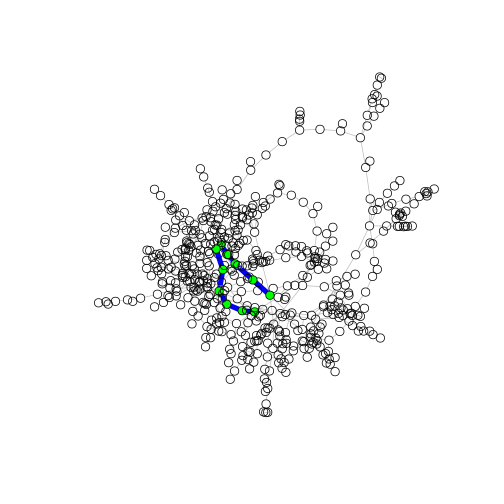
We can highlight a specific node by making it larger and setting its color. (You will need this for the exercise below). Since we only have one main cluster it is helpful to remove genes in the other clusters (all of which are very small).
gene_graphMR4 <- graph.adjacency(genes_adj_MR4, mode = "undirected")

main.cluster <- which.max(clusters(gene_graphMR4)$csize) # find the largest cluster based on size
non.main.vertices <- clusters(gene_graphMR4)$membership %>% # get membership for each gene
  magrittr::extract(. != main.cluster) %>%                  # remove genes in the main cluster from the list
  names()                                                   # the result is a list of the genes that are not in the main cluster

gene_graphMR4 <- delete.vertices(gene_graphMR4, non.main.vertices)

V(gene_graphMR4)$size <- 2                               # define default node size
V(gene_graphMR4)["Bra023998"]$color <- "cornflowerblue"  # define highlight node color
V(gene_graphMR4)["Bra023998"]$size <- 6                 # define highlight node size

plot(gene_graphMR4, layout=layout_with_mds, vertex.label = NA)
path between nodes
Now let’s plot the distance between two specific nodes. Rather annoyingly igraph does not have an easy way to input gene names for the path analysis. It requires that you provide the numeric row number of gene A and how you want to compare that to the column number of gene B. I have written this additional piece of code to show you how this works. We get the shortest paths between ALL genes in the network and then print the results. We are interested in visualizing the path between the gene with the highest betweenness (a possible regulator) and the gene with the highest degree centrality (a possible response gene). Put the relevant GeneIDs in the code below to see the path.
gene_graphMR4 <- graph.adjacency(genes_adj_MR4, mode = "undirected")

main.cluster <- which.max(clusters(gene_graphMR4)$csize)
non.main.vertices <- clusters(gene_graphMR4)$membership %>%
  magrittr::extract(. != main.cluster) %>%
  names()

gene_graphMR4 <- delete.vertices(gene_graphMR4, non.main.vertices)

distMatrix <- shortest.paths(gene_graphMR4, v = V(gene_graphMR4), to = V(gene_graphMR4))
head(distMatrix)[,1:7]

gene1 <- match("Bra007662", rownames(distMatrix))
gene2 <- match("Bra036631", rownames(distMatrix))

pl <- get.shortest.paths(gene_graphMR4, gene1, gene2)$vpath[[1]] # pull paths between node 132 and 45

V(gene_graphMR4)[pl]$color <- "green"                 # define highlight node color
E(gene_graphMR4)$color <- "grey"                      # define default edge color
E(gene_graphMR4, path = pl)$color <- "blue"           # define highlight edge color
E(gene_graphMR4)$width <- 1                           # define default edge width
E(gene_graphMR4, path = pl)$width <- 7               # define highlight edge width
plot(gene_graphMR4, layout = layout_with_fr, vertex.size = 5, vertex.label = NA)
You will need to click on the zoom button on the plot to be able to visualize this well.
Exercise 9:
(A) How many edges separate the gene with the highest degree centrality and the highest betweenness centrality in the plot above? Does there relationship seem direct or indirect? p.s. Does anyone remember Six Degrees of Kevin Bacon?
(B) Plot the MR4 network, highlighting the highest degree centrality node and the highest betweenness centrality node (using different colors)
(C) Do the highlighted nodes fit your expectation of betweenness centrality and degree centrality? Which one do you think better represents a central node in the MR4 network graph? Explain.
Network reconstruction can serves as a hypothesis generator. We now have a hypothesis that these genes are central to gene network in Brassica rapa. Our next bioinformatic step might be to investigate what the network does (GO enrichment). Our next experimental step could be to make knockouts of these central genes and ask how they affected network function and plant phenotype.
Conclusion
You have just done some complex analysis of networks. There are many more ways to think about this type of data. I hope that you can see the usefulness of this abstraction of the biological data. If you are interested in networks I recommend reading the igraph documentation. It has a lot of good information and citations for the theory of networks.
Going further
For ease of analysis we focused on a small set of genes (DP vs NDP). It would be more common to take several thousand most variable genes for network analysis.
For some additional things that you can do with MR graphs, see this repo, where Jennifer Wisecarver demonstrates how to go from MR graphs to network modules.
ClusterONE allows definition of fuzzy (overlapping) network modules and looks very interesting!
If you want to pursue other advanced methods of gene network construction, one that performs well and has excellent documentation and tutorials is Weighted Gene Correlation Network Analysis. It is similar to what we did here but uses more sophisticated methods for determining correlations and cutoff thresholds. WGCNA website